As the digital world continues to evolve, the importance of a well-designed website becomes increasingly evident. A visually appealing and user-friendly website can help businesses establish their brand, attract and retain customers, and ultimately, drive revenue.
In 2023, there are several web design trends to look out for that can help enhance the user experience and create a memorable online presence. From bold typography and asymmetrical layouts to the use of 3D elements and animation, these design trends are sure to set the tone for an exciting year ahead in web design.
With advancements in technology and changing user behaviors, it’s important for businesses and designers to stay up-to-date on the latest trends and developments. This article shall discuss some web design elements to look out for in the coming year.
Web Design Elements That Will Rule 2023
1. The Y2K Wave
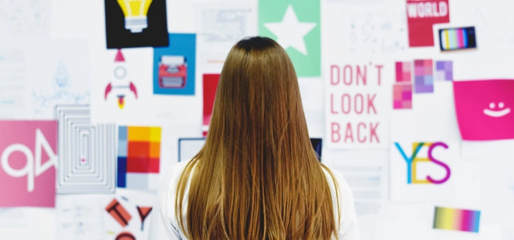
The Y2K aesthetic is characterized by its use of bold colors, futuristic fonts, and unique graphic elements. This style evokes a sense of nostalgia and allows designers to play with creative elements that are both bold and eye-catching. The return of this aesthetic can be seen in the use of gradient backgrounds, neon colors, and chunky fonts, creating an overall futuristic and dynamic look. This aesthetic provides a fun and playful contrast to the sleek and minimalist designs that have dominated the web in recent years.
Businesses that embrace the Y2K aesthetic in their web design will be able to stand out from their competitors, attract new customers, and leave a lasting impression. By using elements from the past in a fresh and modern way, businesses can create a memorable and engaging online presence that appeals to both old and new generations.
Whether it’s through the use of retro-futuristic graphics, bold color combinations, or unique font choices, the Y2K aesthetic is sure to be a popular trend in web design this year. By incorporating this style, businesses can create a unique and memorable online presence that sets them apart from the competition.
2. Customized Typefaces
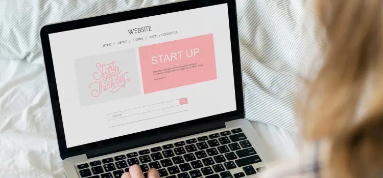
In recent years, text-based website designs have become increasingly popular due to their clean, minimalist, and sophisticated look. However, as customers seek out unique and immersive experiences, businesses are looking for ways to make their text-based designs stand out. This is where custom fonts and hand-created lettering come in.
Custom fonts allow businesses to create a unique visual identity for their brand, setting themselves apart from the competition. By using custom fonts, businesses can add personality and character to their website, creating a more memorable and engaging experience for visitors.
Hand-created lettering is another way businesses can add a personal touch to their text-based website designs. This technique involves creating bespoke typography by hand rather than using pre-made fonts. Hand-created lettering is a great way for businesses to showcase their creativity and add a unique touch to their website.
Custom fonts and hand-created lettering offer businesses the opportunity to add a personal and unique touch to their text-based website designs. As customers seek out more immersive experiences online, these techniques are set to become increasingly popular in 2023.
3. Deep Dimensionality
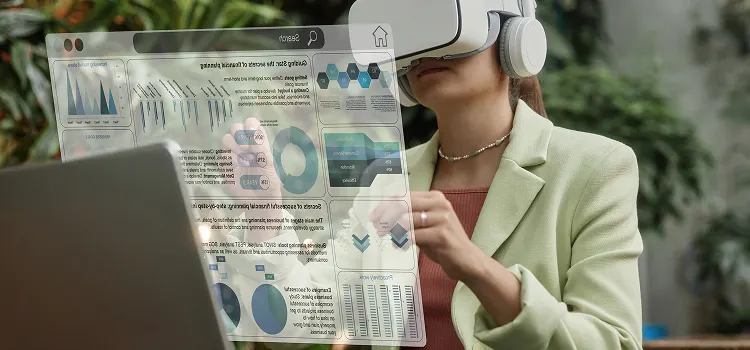
The metaverse, or a virtual world that exists as an extension of the real world, is becoming increasingly popular, and its influence on web design is rapidly growing. As businesses aim to create more immersive online experiences for their customers, using 3D illustrations and Claymorphism is becoming a leading trend in web design.
3D illustrations allow businesses to create a more dynamic and engaging experience for their customers while also providing a unique visual representation of their brand. These illustrations can be used to bring products, logos, and characters to life, adding a new dimension to the customer’s experience.
Claymorphism, on the other hand, provides a soft, 3D effect by combining inner and outer shadows. This technique can be used to add depth and texture to a website, creating a more visually appealing and interactive experience.
Animations, full-page effects, and multi-layered illustrations are also becoming increasingly popular as businesses aim to create a more dynamic and immersive online experience for their customers. These techniques help to bring a website to life, creating a more engaging and memorable experience for the user.
The metaverse is already influencing web design in new and innovative ways. With the increasing popularity of 3D illustrations, Claymorphism, animations, and other immersive techniques, businesses can create a more dynamic and engaging online experience for their customers. Whether the metaverse becomes more than a fascinating experiment remains to be seen, but its impact on web design is undeniable.
4. Muted and Soft Colors
Soft and muted colors, if used right, can work better than bright and loud colors. According to a study conducted by Top Design, states that 39% of users prefer pastel-toned colors.
They are a popular choice for creating a minimalist and understated look, as well as for highlighting specific elements on a page. Muted colors are often combined with white space, simple typography, and clean lines to create a modern, professional aesthetic.
Using muted colors in web design can also help to direct the user’s focus toward the most important elements on the page. When using muted colors in web design, it is important to consider color contrast, as well as the color palette used throughout the site. If you are able to match them to the colour of your product, that is an added bonus.
5. Minimalism
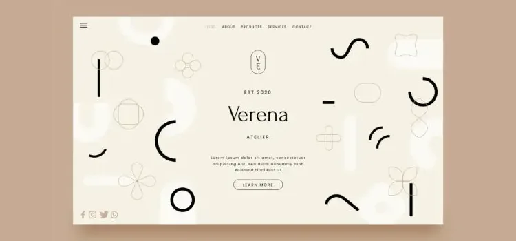
Minimalism is a popular trend in web design that has been gaining traction in recent years. This design philosophy emphasizes simplicity, clean lines, and a lack of clutter. The goal is to create a visual environment that is uncluttered, focused, and easy to use.
One of the main advantages of minimalism in web design is that it allows the content to shine. By reducing the number of visual elements on the page, the user is able to focus on the most important information without being distracted by unnecessary graphics or adverts. This is particularly important in the current age of information overload, where users are constantly bombarded with an overwhelming amount of data.
Minimalism also makes web pages load faster and can help to create a more visually cohesive and professional-looking website. The absence of distractions means that the user is more likely to focus on the intended message and take the desired action, such as making a purchase or signing up for a newsletter. It is not just a great design choice but also a great psychological technique to influence customer behavior.
In Conclusion
The key to success in web design is to focus on what works for your business and your customers and to continuously experiment and innovate. By staying on top of these web design trends, businesses can create an online presence that is not only visually appealing but also functional and engaging for their customers. However, it’s important to remember that the most successful websites are those that strike a balance between form and function. This is where Saffron Tech comes into play. We are a digital tech agency that has the solutions to all your needs. Contact us today to get the website of your dreams and more!
Subscribe to Saffron Tech
Explore your marketing zen with our newsletter! Subscribe now.


